Continuous Improvement Metrics for Social Care Teams
"Learn how continuous improvement metrics can transform your social care outcomes. Discover key indicators, tracking methods, and actionable insights to boost"
Monday's dashboard review looks great until you open the wrong slice. Response time is down. Auto-closure is up. The queue from X, Discord, WhatsApp, and DMs looks under control after a nasty outage surge, a scam wave, and a pile of billing complaints under angry Instagram replies. Then someone checks repeat contacts in Spanish-language DMs and finds the quiet failure your top-line graph hid. The system got faster by making customers come back.
That's the trap with most continuous improvement metrics in social care. They're built like scorecards, not experiments. A green widget on response time or automation can hide bad routing to finance, premature closure on a payment complaint, or a trust and safety report that got tagged as noise because the wording looked like spam. In an AI-assisted unified inbox, dashboards don't just summarize the work. They can also conceal where automation is shifting effort from reviewers onto customers.
Table of Contents
- Why Your Social Care Dashboard Is Lying to You
- Where Continuous Improvement Metrics Come From
- The Four KPIs That Run a Social Care Operation
- Why Every Speed Metric Needs a Quality Counter-Metric
- Instrumenting the Metrics Inside a Unified Inbox
- Turning Metric Movement Into Real Experiments
- The Persistence and Equity Scorecard Most Teams Never Build
- Building the Weekly Feedback Loop and Dashboard
Why Your Social Care Dashboard Is Lying to You
The lie usually starts with a blended average.
An outage hits. X mentions spike with service complaints. Discord fills with workaround threads. WhatsApp gets account access questions. A few posts carry real PR risk because creators are tagging journalists, and mixed into all of that are scam reports, duplicate posts, and feature requests buried in DMs. Your AI triage layer starts filtering noise, tagging intent, and drafting replies. By Friday, the review deck says the operation got faster.
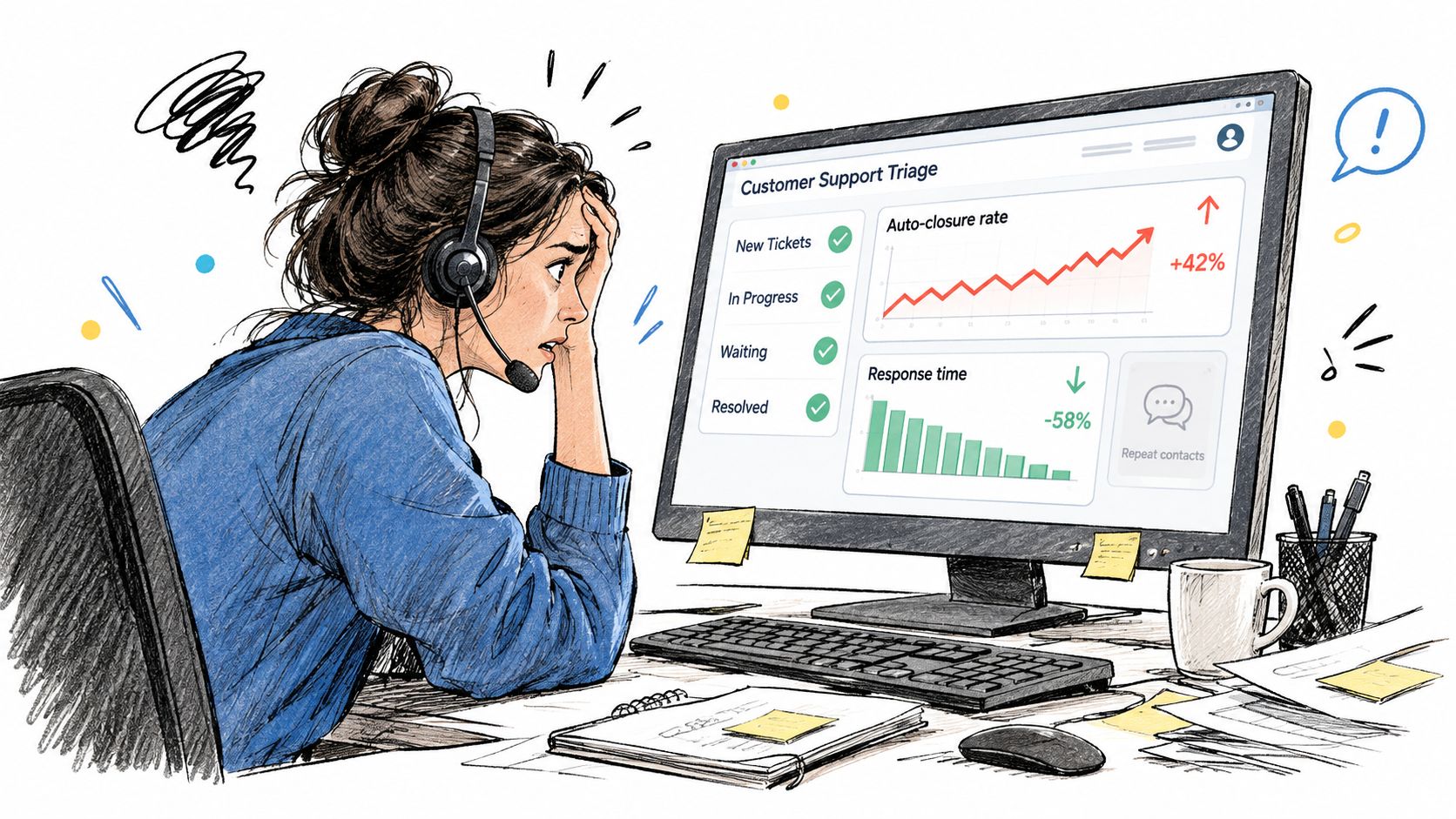
That's often where the meeting stops, and it shouldn't. If your response-time panel improved because teams counted auto-acknowledgements instead of substantive replies, the metric is flattering the system. If auto-closure climbed because the model applied broad closure rules to multilingual billing complaints, the metric is flattering the model. If repeat contacts rose in one language or one channel, your dashboard didn't catch improvement. It caught displacement.
What the top line hides
A social care dashboard can mislead in a few predictable ways:
- Blended channels hide different realities. X mentions during an outage behave differently from WhatsApp account recovery or Discord product questions.
- Automation rates hide quality debt. A higher auto-closure number can mask reopened cases, recontacts, and escalations that should've happened earlier.
- Queue health hides readiness gaps. If your site experience or support surfaces are weak, social volume rises for reasons the inbox can't solve alone. That's why ops teams should also check your site's agent readiness before treating every inbox spike as a staffing problem.
Practical rule: Never celebrate a speed gain until you've checked the customer's second move, did they leave satisfied, or did they come back harder to handle?
Continuous improvement is a hypothesis, not a screenshot
What works is treating every dashboard improvement like a claim that needs proof. If response time fell, ask what changed in routing, staffing, drafting, or closure logic. If automation rose, ask what happened to reopens, repeat contacts, and escalation quality. If one slice worsened while the total improved, the total isn't the truth you should operate from.
The teams that get this right don't just review numbers. They test whether a metric move reflects a better system. That's the difference between reporting and improvement.
Where Continuous Improvement Metrics Come From
A unified inbox can report faster replies while customers wait longer for a useful answer. The remedy comes from an older discipline than AI triage or channel consolidation. In the 1920s, Walter Shewhart's work at Western Electric and Bell Telephone Laboratories introduced control charts, a formal method for separating ordinary process variation from abnormal signals. That foundation carried into the Shewhart cycle, PDCA, and the logic behind DMAIC in Six Sigma, as described in the PDA overview of metrics implementation and improvement history.
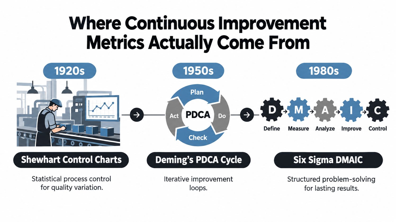
That history changes how a social care lead should read a dashboard. A weekly total of closed conversations has little meaning without context. Shewhart's contribution was to measure against a baseline, monitor variation over time, and test whether a change produced a sustained effect. Deming's Plan, Do, Check, Act preserved that logic, as did Six Sigma's Define, Measure, Analyze, Improve, Control sequence.
What that means inside a social care operation
A control-chart mindset gives a unified inbox a practical operating method:
- Baseline first. Record pre-change levels for routing time, substantive first response, escalation quality, and repeat contacts.
- Track variation over time. One green week after a rules change cannot establish improvement.
- Tie data to interventions. If auto-tagging changes for payment disputes, log the change and monitor related outcomes rather than only the total queue result.
- Pair speed with quality. A faster automated response needs counters for reopens, repeat contacts, escalation errors, and language-specific failures.
NIST describes improvement as measuring performance, evaluating it against targets, and using the findings to guide improvement, with PDCA and DMAIC serving as practical structures, in its performance measurement and process improvement guidance.
The inherited discipline most teams skip
Teams that inherit the vocabulary of improvement without the discipline often turn “continuous improvement metrics” into KPI reporting. The two practices answer different questions. A scorecard records whether a number moved. An improvement loop tests whether the system changed, whether the result persisted, and whether the movement followed a decision the operator can defend.
When AI drafts replies and auto-tags intent, “check” means reviewing the model's gain across languages, channels, risk tiers, and the messy segments where customers feel failure.
That review should also test equity. A faster average can coexist with slower service for one language or customer segment, while a higher automation rate can reflect premature closure rather than resolution. If the dashboard cannot separate ordinary variation from meaningful change, it is modern software wrapped around a pre-Shewhart habit.
The Four KPIs That Run a Social Care Operation
Most social care leaders already have dozens of widgets. Few deserve executive attention. The four that run the operation are auto-resolution rate, time-to-first-response, noise-filtered percentage, and proactive saves. Each one only works when the definition is precise and the cuts are consistent across channel, language, intent, and risk tier.
The four metrics in one view
| KPI | Formula | Required Segmentation | Silent Failure Mode |
|---|---|---|---|
| Auto-resolution rate | Eligible conversations closed without human intervention divided by eligible conversations | Channel, language, intent, risk tier | Premature closure hides unresolved follow-ups |
| Time-to-first-response | Time from intake to first substantive response | Channel, language, intent, routing destination | Auto-acknowledgements masquerade as service |
| Noise-filtered percentage | Content classified as non-actionable and removed from active review divided by total intake | Channel, source type, language, risk tier | Real issues get buried as spam, duplicates, or low-priority chatter |
| Proactive saves | High-risk or high-value issues identified and handled before wider fallout | Channel, issue type, customer risk, escalation path | Teams claim saves without a consistent verification rule |
What each KPI should mean
Auto-resolution rate sounds simple until the definitions get messy. Count only eligible conversations closed without human intervention, and exclude spam, duplicates, tests, and unresolved follow-ups. If the operation cannot show which conversations were eligible, the metric is only a vanity number with a dashboard skin. In practice, the useful version always travels with a quality guardrail.
Time-to-first-response needs a hard line between a substantive reply and an automated acknowledgement. Freshworks reports an average first response time of 15 seconds for conversations and 16 minutes for ticketing, which is exactly why blended averages can mislead cross-channel teams, according to the Freshworks customer service benchmark report.
Noise-filtered percentage matters more in social care than many support leaders want to admit. Scam waves, duplicate outage complaints, meme replies, and comment pile-ons can consume reviewer time without improving customer outcomes. The risk is obvious: if the classifier gets too aggressive, it can suppress weak-signal complaints, multilingual slang, or reputational issues that read as informal on first pass.
Proactive saves is the metric teams usually underbuild. It is where the operation earns trust by catching a brewing issue before it becomes a public escalation, routing a fraud signal to trust and safety, or surfacing a product defect trend before volume overwhelms support. If you cannot verify why a save counted, the number will drift into storytelling.
For teams that want a broader refresher on KPI definition outside support queues, SuperX KPI insights for creators is a useful contrast because it shows how context changes what a “good” metric definition looks like.
Precision beats volume
ISO 22400 is blunt about KPI design. Definitions should specify formulas, constituent elements, time behavior, units or dimensions, and applicable user groups, which is why “AI closed issues” is not a real metric without scope, exclusions, timestamps, and ownership, as outlined in the ISO 22400 standard overview.
If a KPI cannot survive a dispute over what belongs in the numerator and denominator, it is not ready for decision-making.
Why Every Speed Metric Needs a Quality Counter-Metric
A fast operation can still be a bad operation.
That's the central mistake in how teams use continuous improvement metrics. They assume throughput proves service quality. It doesn't. Research on performance measurement distinguishes systems designed for continuous improvement from systems designed for hierarchical control, and that distinction matters in AI-assisted social care because a metric can push learning or just pressure people to make a dashboard look better, as discussed in the Financial Accountability and Management research on continuous improvement versus control-oriented measurement systems.
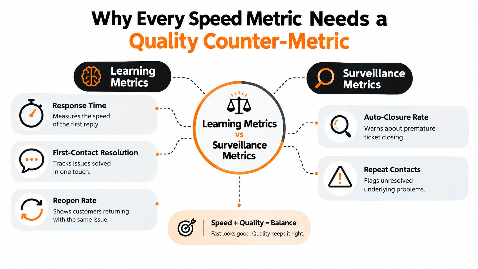
Learning metrics versus surveillance metrics
A learning metric helps you understand whether the system got better. A surveillance metric mostly tells people they're being watched.
Here's the practical split in social care:
- Speed and throughput metrics include response time, auto-closure, and queue clearance.
- Quality counter-metrics include first-contact resolution, reopen rate, repeat contacts within a short window, escalation accuracy, sampled audit correctness, and post-resolution sentiment.
A speed metric without a quality counter-metric invites gaming. A quality counter-metric without a throughput metric can make the operation slow and defensive. You need both.
Here's a useful visual for that balance:
The counters that catch bad automation
First-contact resolution is one of the cleanest checks. It measures whether the issue was fully resolved in the initial interaction without callback, transfer, escalation, or follow-up. A published benchmark puts average FCR at 68% in 2023, with a range from 39% to 91%, describes 70% to 79% as a good operating range, and calls 80% or higher world-class, according to the SurveyPal customer service benchmark report.
Repeat contact within 48 to 72 hours is the counter that exposes false auto-resolution. That's especially useful when AI closes routine questions well but mishandles emotionally charged or ambiguous cases. The Notch AI support benchmark discussion explicitly recommends pairing automated resolution with repeat-contact tracking in that 48 to 72 hour window.
Two common failure patterns
A billing complaint in a DM gets auto-closed after a polished reply. Response time looks great. Auto-resolution looks great. The customer comes back two days later because the refund never moved. The speed metric says success. The repeat-contact counter says failure.
A scam report gets tagged as noise and never reaches trust and safety. Queue health improves. Reviewer fatigue drops. The customer experience got worse and the risk got higher.
A metric should travel with the counter that can embarrass it. If it can't be contradicted, it can't teach you anything.
That's the operating rule. Speed tells you whether the machine moved. Quality tells you whether it moved in the right direction.
Instrumenting the Metrics Inside a Unified Inbox
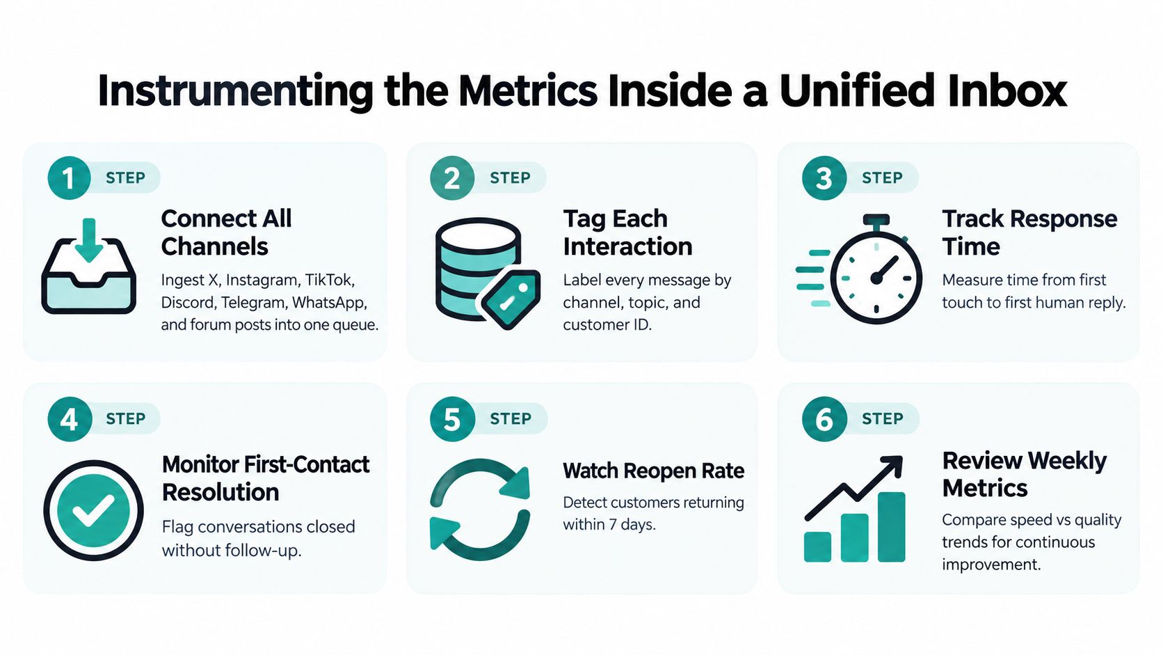
Good metrics fail more often because the definition is fuzzy than because the team lacks intent. In a unified inbox that pulls in X, Instagram, TikTok, Discord, Telegram, WhatsApp, and forum posts, every KPI needs a written specification. Not a tooltip. A versioned artifact the team can audit, compare, and revise without guesswork.
The minimum specification every KPI needs
A usable template includes six parts:
- Formula. Define the numerator, denominator, and any guardrails.
- Data source. Name the event tables, audit sample, CRM sync, or moderation log the metric depends on.
- Event timestamps. Capture intake time, first substantive response, escalation time, closure time, and reopen time.
- Inclusion and exclusion rules. Spell out spam, duplicates, tests, bot loops, unresolved follow-ups, and merged conversations.
- Ownership and refresh frequency. Someone should own the definition, and the team should know whether the metric refreshes in real time, hourly, or daily.
- Target and alert threshold. A target alone is not enough. The team also needs to know what deviation triggers investigation.
Metric documentation only works if it survives handoffs. The OpenTelemetry semantic conventions are useful here because they push teams toward consistent naming and machine-readable structure. That same discipline matters in social care, even when the work spans public replies, private messages, and escalation queues.
What breaks comparability
Silent definition drift is the biggest failure mode. One market excludes spam from the denominator. Another does not. One team counts AI-drafted replies as first response before approval. Another waits for a human-approved send. The dashboard then compares numbers that are not peers.
A practical setup inside tools such as Sift AI, CRM reporting, and BI layers like Looker or Power BI should treat metric definitions as versioned documents attached to the reporting layer, not tribal knowledge buried in a Slack thread.
Audit check: If you changed routing logic last quarter and also changed the metric definition, you probably cannot tell whether the process improved or the math did.
That check matters because dashboards can look cleaner while the work gets sloppier. A faster queue is useful only if the same definition still captures what happened to the customer.
Build for messy reality
Social care instrumentation has to survive edge cases:
- Multilingual slang that breaks intent tagging
- Cross-channel duplicates where the same user posts on X and sends a WhatsApp message
- Escalation forks to finance, engineering, comms, or trust and safety
- Human overrides when the model is uncertain but the issue is high risk
If the KPI definition does not say how those cases are handled, the number will drift the moment volume gets ugly. Teams chasing speed alone usually miss that point. The better setup pairs each speed metric with the quality counter-metric that can challenge it, then keeps both definitions visible in the same place.
Turning Metric Movement Into Real Experiments
Monday morning, first response time is down, the queue looks cleaner, and the dashboard says the new routing logic worked. By Wednesday, agents are asking why billing threads keep boomeranging back from finance, Spanish WhatsApp cases are waiting longer, and reopened conversations are climbing. That is the point where a metric stops being a scoreboard and becomes an experiment.
A useful experiment is small, traceable, and paired. Start with the baseline for the target KPI and the quality counter-metric that can challenge it. Write the hypothesis in plain language. Change one variable. Then check whether the gain shows up only in the average, or whether it survives contact with channel, language, issue type, and risk. That discipline matters because performance measurement is meant to support improvement, not just report movement, as noted earlier.
A workable experiment template
Use this sequence:
Establish the baseline
Capture the pre-change level for the target metric and its quality counter-metric across the segments that matter, channel, language, issue type, and risk.Write the hypothesis plainly
Example: tightening routing rules for billing complaints should reduce time-to-correct-owner without worsening repeat contacts or handoff quality.Change one variable at a time
Do not roll out a new classifier, a staffing change, and a new closure rule in the same week if you want a clean read.Segment before you conclude
Better results in English public mentions can hide worse outcomes in private multilingual support.Log the intervention with the outcome
Teams need to be able to tie the movement back to the exact rule, workflow, or model change that could have caused it. That is basic test discipline, not dashboard hygiene, and it is the difference between learning and storytelling.
Escalation rate shows why context matters
Escalation rate is where weak experimentation usually gets exposed. The Stealth Agents escalation benchmark summary cites one benchmark where 72% of incidents were resolved at the first level, leaving 28% escalated, while another benchmark treats below 10% as good. Both figures can be true in different operating contexts. Neither tells you, on its own, whether your change improved the service.
In practice, I treat escalation rate as a signal that needs company. A rise can mean the triage model is catching higher-risk work earlier. It can also mean permissions are broken, routing is messy, or teams are handing ownership back and forth. The only honest read comes from checking reason mix, post-handoff resolution, and reopen behavior alongside the rate itself.
Teams get this wrong when they ship a model update, see one KPI improve, and call it a win.
Require every metric movement to answer three questions:
- Was the change linked to a specific intervention?
- Did the counter-metric stay healthy?
- Did the result hold across the segments that matter?
If any answer is no, keep testing.
The Persistence and Equity Scorecard Most Teams Never Build
A good month is not continuous improvement. It's a good month.
That distinction matters because research reviewing Lean adoption found that studies often rely on cross-sectional designs and fragmented, non-comparable measures, which limits evidence for sustained cultural change or durable gains. The same review also notes that employee involvement in continuous improvement was positively associated with quality, service, predictability, and wellbeing, while Lean techniques were associated with efficiency and predictability but not quality, service, or wellbeing, according to the review of Lean adoption research in healthcare and organizational settings.
What a persistence and equity scorecard should include
Track movement at 30, 90, and 180 days. Then cut it by:
- Language. Don't let English performance stand in for everyone.
- Region. Staffing coverage and policy differences can distort outcomes.
- Channel. Public mentions, private DMs, forums, and chat apps behave differently.
- Issue type and risk tier. A win on routine questions can hide losses on fraud, billing, or reputational cases.
That scorecard should separate leading indicators from lagging indicators. Leading indicators include training completion, routing-confidence coverage, and unresolved-signal backlog. Lagging indicators include repeat contacts, escalations, churn-risk saves, and verified resolution.
Why this changes decisions
A local gain that disappears after launch week isn't improvement. A routing change that helps one language while hurting another isn't improvement either. It's selective efficiency with hidden cost.
If a metric gets better for the majority while degrading service for minority-language users or high-risk issues, the system learned the wrong lesson.
The practical value of a persistence and equity scorecard is that it stops teams from mistaking a campaign effect, a temporary staffing spike, or a favorable queue mix for a better operation. That's especially important in social care, where volume shifts fast and the most vulnerable customer groups are often the least visible in summary reporting.
Building the Weekly Feedback Loop and Dashboard
Monday at 9:00, the dashboard is green, first-response time is down, and auto-resolution is up. By Tuesday afternoon, the complaints start. Spanish-language WhatsApp cases are sitting longer, agents are overriding the new routing rule, and high-risk billing threads are piling up in a queue that never shows up on the top-line view. That is why the weekly review cannot be a scoreboard review. It has to function like an operations review for live experiments.
A useful dashboard has three layers. The first is at-a-glance health. Put the four operating KPIs at the top and pair each one with its quality counter-metric so no one celebrates speed in isolation. The second is drift detection. That is where language parity, region parity, backlog age, escalation-reason mix, and persistence views belong. The third is the experiment log. Show open hypotheses, recent rule or model changes, owner names, review dates, and what happened after the change went live.
What belongs in the weekly review
The weekly cadence should answer a simple question. Did performance improve, or did the system just move work somewhere less visible?
Run the review in a fixed order:
- Start with the KPI pairs. Look for movement that separates speed from quality, such as faster first response with lower verified resolution, or higher auto-closure with more repeat contacts.
- Check where the change came from. Break the movement out by language, channel, region, issue type, and risk tier before calling it a win.
- Review failure-catching counters. Human override rate, backlog age, reopen rate, and escalation reason mix will usually expose bad automation before the headline KPI does.
- Assign owners by failure mode. Finance should own payment-dispute routing issues. Engineering should own reproducible product defects. Comms should own public-risk patterns and response posture.
- Approve one controlled change at a time. Adjust a rule, retrain a tag set, or tighten an escalation path, then write down the expected effect, the counter-metric that could invalidate it, and the date for review.
This sounds slower than shipping changes freely. In practice, it is faster, because teams spend less time cleaning up after false gains.
I have seen the same mistake more than once in unified inboxes that cover X, Discord, WhatsApp, and private DMs. A new automation rule cuts handle time, so everyone relaxes. Then override rate climbs in one channel, or moderators start bypassing the suggested tag because it fails on slang, mixed-language messages, or sensitive safeguarding cues. If the weekly review does not force those checks, the dashboard rewards the wrong behavior.
What a green dashboard means
A green dashboard means the operation got better without pushing failure into another queue, another language, or another team.
That is a high bar. It should be. In social care, a speed gain only counts when the quality counter stays healthy, the result persists beyond launch week, and the improvement holds across the customer groups that summary reporting tends to flatten.
The point of continuous improvement metrics is not prettier weekly slides. It is a working feedback loop where automation removes noise, humans review the edge cases that matter, and every claimed win survives contact with quality, persistence, and equity checks.
If your team is juggling response time, auto-closure, routing, and escalation quality across social and community channels, Sift AI gives you a unified inbox, AI tagging and routing, and the analytics layer to measure those moves without losing the human review that high-risk cases need. If you want a social care operation that treats improvement like an experiment instead of a vanity dashboard, it's worth seeing how that workflow looks in practice.